Now that we’ve got the basics of the block built, it’s time to introduce some of the features afforded to us by the WordPress API that allow us to make changes to the visuals of our block. Namely, we want to using block attributes for custom colors.
Sure, up to this point, we’ve bee building the blocks using the WordPress APIs for block creation, serialization, and displaying, but we’ve also hard-coded a lot of our our styling. And when it comes to building custom blocks, sometimes that’s exactly what we want to do.
But other times, we want the users to be able to change, say, the color of their text or the background of their blocks, or maybe both. And the APIs for the Block Editor make this possible. As with the rest of the content of this series, though, it’s not without understanding what’s available to us.
Since this series builds upon itself, I recommend reading and following the previous articles thus far especially if you’re just now stumbling across this content.
So far, these are the things we’ve discussed:
- Required Tools, Plugin Structure, Dependencies, Block Metadata
- The Backend, The Frontend, Functionality, Styles, a Working Demo
- Block Attributes, Editable Content, Components, Editor Styles
- Saving Data, Styling the Frontend
If you’re ready to continue, we’ll get started. Remember, now that we’re this far in the series, I’m working to keep the articles a bit shorter. This is because:
- We’ve laid enough ground work so it’s easier to focus on one thing at a time,
- I find it easier to digest one concept at a time especially when it comes to learning something new, like building blocks as a backend engineer 🙂.
So in this post, we’re going to focus on one new thing: Introducing color options for our block.
Block Attributes for Custom Colors
At the end of the last post, I wrote the following:
There are a variety of places we can go from here especially as it relates to styling our block and introducing features for users to customize what they see.
And as I mentioned earlier, that’s what we’re going to be doing by taking advantage of what WordPress provides for us. Assuming you’ve still got your code set up from where we left off in the last article, that’s where we’re going to pick up today.
🧱 Block Attributes
A few articles ago, I talked about block attributes. You can read more about them in said article or in the Block Editor Handbook but the gist of it this: There are certain features that can be enabled via defining certain values in the configuration file.
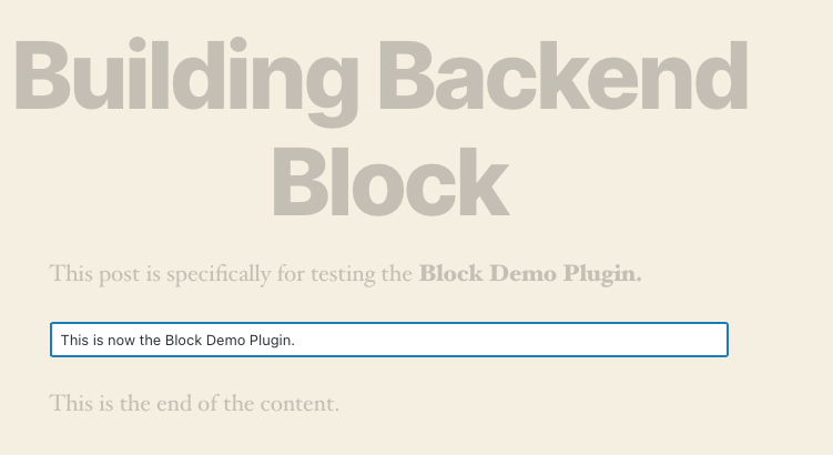
And in this case, we’re looking to introduce both text and background colors. Before doing that, though, let’s take a look at what the UI of our custom block looks like in the context of WordPress right now:
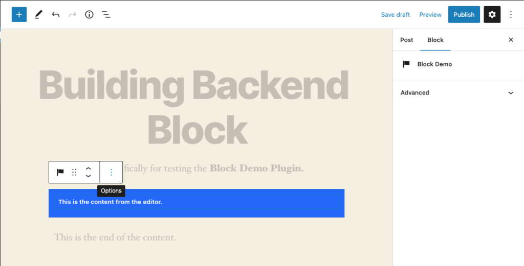
Notice that when you add the block to your post, you have the ability to edit its content and that’s all. The rest of font color and the background color are provided for you (technically, they are provided by us since we’re writing the styles for the block but you get the idea).
But what if you want to give the user the ability to change that? This is where additional block attributes come into play.
⌨️ Update the Block Attributes
First, we’re going to update the attributes to add support for color of text and background. Locate the area of index.js that looks like the following:
attributes: {
    content: {
        type: 'string',
        source: 'text',
        selector: 'input'
    },
},
And then update it so that it includes the support element:
supports: {
    color: {
        text: true,
        background: true
    }
},
attributes: {
    content: {
        type: 'string',
        source: 'text',
        selector: 'input'
    },
},
Then run $ npm run build to rebuild the assets. And at this point, you can refresh your post. You may need to remove the block and then re-add it since it has new code associated with.
🔎 Review Block Changes
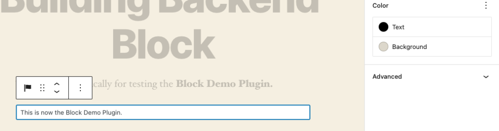
Now, when you add the block, you should see new options in the sidebar or the Settings as WordPress actually calls it, and it looks like this:
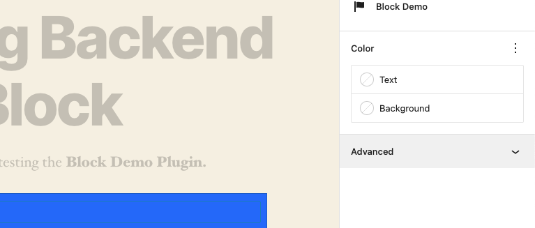
Notice that there are now options for Text and for the Background. Furthermore, if you edit the text and then select it and edit the background and change it, the changes will be reflected in the editor.
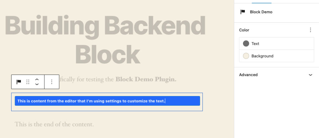
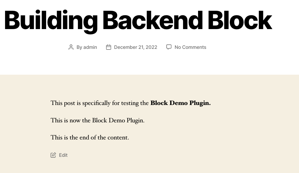
Then, if you preview or publish and view the page, you’ll see the block as you’ve styled it. For example, here’s an example of the block that I have running in the editor with some sample content along with customizations from the sidebar:
And when I preview this on the frontend, we see the following:
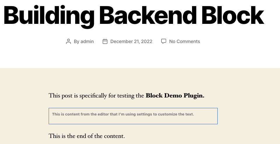
Obviously, the new features are working sort of.
The frontend looks good but the editor is still not quite matching the content of what we’ve put in place. Why is that?
Recall that we’ve had to use a TextControl for the block in the editor and that we’ve also written some custom styles to try to draw parity between the editor and the frontend.
Now that we’ve got options for customizing the block, we need to refactor the styles of the block so that they work based on what the user writing and what the user is setting.
👣 Refactoring Styles (One Step Forward, Two Steps Back)
Before moving forward with taking advantages of these new settings, we need to understand something about the TextControl. Specifically, from the handbook:
TextControls are best used for free text entry.
It also goes on to say the following:
TextControls should:
- Stand out and indicate that users can input information.
- Have clearly differentiated states (selected/unselected, active/inactive).
- Make it easy to understand the requested information and to address any errors.
- Have visible labels; placeholder text is not an acceptable replacement for a label as it vanishes when users start typing.
So the bottom line is that these controls should give users the ability to know when they can enter text and when they can’t. This means that trying to create parity between what the user enters on the backend needs to provide an affordance they can do so.
This means there are some decisions that have to be made:
- Do we want to try to force the editor to look exactly like the frontend?
- Should we define clear styles for the backend to indicate what the user can and cannot edit?
- How do we handle what the user has provided in the backend to render on the front end?
As far as the points above are concerned, I have several thoughts.
The Input Element
As far as the TextControl is concerned:
- The user needs to know what they can and what they cannot manipulate. Input areas have a very consistent style across all types of interfaces (be it the web, apps, mobile apps, and so on) so relying on out-of-the-box styles is usually a good idea.
- The handbook itself states: “Stand out and indicate that users can input information.”
- Thus, the control needs to differentiate itself from the rest of the content in the block.
That means that when it comes to refactoring the block, the first thing we want to do is restore the input element to exactly how it looks. And since we’re going to be refactoring the rest of the block around this, let’s
- Empty the stylesheet temporarily,
- Remove the placeholder from the
TextControlas per the guidelines in the Handbook.
This means the index.scss file should be empty and when you run $ npm run build, the block will look something like this:
And when we save the post and view it, this is what we see on the frontend:
Notice the value simply inherits what the user has provided. And that’s okay. Remember, sometimes in the editor, content the user provides is going to be static on the frontend not unlike how we draft posts.
So this raises a question: How do the new color settings affect a more basic block? Let’s take a look.
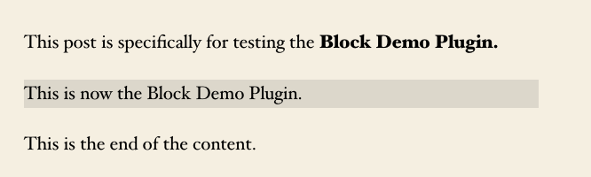
First, select a text color using the settings. Given that I’m using the a default theme, I’m going to select the Primary color which is #000000. Then I’m going to select Subtle Background which is #DCD7CA for the color of the background of my block.
In the editor, this is what I see:
As you can tell, there’s no visual indicator that this has changed anything with regard to the block. But what does it look like on the frontend? Save the post and view it. If you’ve followed along with my work, then you’ll see something like this:
And this is what we’d expect given what we’ve changed thus far. To be fair, it isn’t much:
- We added a point as to what the block supports in terms of colors and background,
- We’ve removed the styles we’ve had in favor of following the rules of the handbook.
Though it may not seem like much, these are the types of things that are key to understanding when working not only with blocks but with style guides in general:
That however you think it ought to work doesn’t necessarily mean it’s the recommended way for it to work. And to that end, I hold the opinion that it’s best to follow the guidelines of any style guide, handbook, or standards that you have so that the work you produce looks as if it’s part of the natural design language for the software system in which you’re working.
So we’ve come all this way to learn a bit more and reduce some of what we have. What’s next?
⏭️ TODO
At this point, we’re primarily left with what we had in the last post: A block that allows users to enter input and see it on the frontend. The thing we have added gives users the ability to style their work without having to write any code and that’s useful.
So where do we go from here? Let’s say we want to create a block that provides the user with a set of information and then asks them to input data in the editor to render it on the frontend.
This could give way to something even more complex in a future iteration such as allowing the user to enter something on the frontend to submit to a form, another endpoint, or something like that.
So as I continue with the series, we’re first going to look at what’s required to implement a custom block that includes:
- a heading,
- a paragraph,
- and an input field to help guide the ultimate output.
We’ll continue to use the customization options we’ve outlined in this post and show how we can apply them to what the user provides and how to ignore them for what we, as the developer, provide.
After that, we’ll look at adding an input to the frontend of the site as well as incorporating a SlotFill.
But it’s going to take us a few more articles to cover all of that information.