The first two articles in this series have been long. Not only long in terms of the content they cover, but long in comparison to the usual content I write. Part of this is because of the nature of what I’m trying to cover and part of it has to do with getting the basic plugin going.
We’re at a point now, though, where we can start to shorten the length of the article and focus more narrowly on the functionality and its implementation.
If you’re stumbling across this series and this is the first post you’re reading or you’ve not done any of the work prior to get everything off the ground yet (as I don’t have a GitHub repository set up for this plugin just yet – and that’s on purpose 🙂), here’s what’s been covered so far:
- Required Tools, Plugin Structure, Dependencies, Block Metadata
- The Backend, The Frontend, Functionality, Styles, a Working Demo
In the previous article, I stated:
In the next article, we’ll start talking about how we can edit text within the context of the Block Editor, how to save the changes, and then view them on the frontend.
Originally, I planned to cover the following in a single article:
- convert the element in the block editor into a field we can edit,
- save the content of the field,
- render the content that’s above
Instead, I’m going to cover just the first point above so we can focuses solely on the editor and how to manipulate data within its context. Then we’ll follow the article up with how to save the content and render it on the frontend.
Block Editor Blocks: Editable Content
Recall from the previous article, working with blocks into the Block Editor is usually made up of two functions:
And though this article is primarily going to be concerned with allowing us to edit the content within the Block Editor, it’s important to remember that the function names are overloaded.
That is, edit can be thought of as the function in which the code responsible for manipulating the data and that’s it (which isn’t all that bad). However, save has much more responsibility.
Since we’re about to get into the functionality of editing content in the Block Editor and that content will eventually need to be saved and rendered, this is why I’m breaking this topic into multiple parts.
💭 Understanding Block Attributes
Before getting into anymore code, there’s an important concept to understand regarding blocks specifically when it comes to editing and serializing information. And that’s the concept of block attributes.
From the handbook:
Attributes are the way a block stores data, they define how a block is parsed to extract data from the saved content.
Block Attributes
Personally, I wish this is was a little more fleshed out within the Handbook but I’ll do what I can to expand on it here.
First, it’s important to note that attributes are passed to the registerBlockType function.
Secondly, they are the second argument passed (after the name of the block), and is a JSON object – or, more generally, a data structure – that identifies what content is going to be saved and how it can be read.
Third, the JSON is structured such that the attributes node has child elements where each child represents the content to be saved. For example, let’s say that we’re going to have a content string. Then, the data structure would start to look like this:
attributes: {
  content: {
  }
}
And in our case, we’re going to be working with a string that will be located within an input element (which I’ll discuss later in this article). So the structure could look something like this:
attributes: {
  content: {
    type: 'string',
    source: 'text',
    selector: 'input',
  }
}
And this is but a simple example. We’ll see this more in just a bit. Note there are only a few supported types for blocks which can be found here
💭 How Do We Set These Attributes?
Another concept that we have to understand when it comes to attributes is how to actually set or save them for the block we’re creating. And since we have the data structure available, either we’re going to need to write the code or we can leverage something that exists within the underlying application.
This function allows the block to update individual attributes based on user interactions.
Block API
This is where the setAttributes function comes into play. In short, setAttributes is a function provided by WordPress that allows us to save the attributes data structure whenever we’re editing the content of a block.
The main take away right now is that both the attributes structure and a reference to the setAttributes function need to be passed to them edit function.
For example, the function signature will now look something like this:
edit: ({ attributes, setAttributes }) => {
  // ...
}
And now we can call this function within edit whenever content is being edited. We’ll see how this works when we get into the implementation.
⌨️ Converting an Element Into Editable Content
Now that we’ve covered how a block can have attributes and those attributes can be saved, it’s time to begin refactoring the edit function so it allows us to actually edit the content of the block.
Recall from the previous articles that our edit function currently looks like this:
edit: () => {
    return (
        "This is content from the editor."
    );
},
We need to update this in three ways:
- add support for attributes,
- update the function to work with those attributes,
- use an available control to make the text editable.
Here’s how we do all of the above.
Attributes
First, let’s add the attributes data structure that outlines the data that needs to be serialized from the editor:
registerBlockType(name, {
    attributes: {
        content: {
            type: 'string',
            source: 'text',
            selector: 'input'
        },
    },
Note here that the selector type we’re using is an input. This has to do with the type of control that we’re going to be using later.
For the sake of clarity, though, know that we’re going to be leveraging a control within our div element such that the user can edit the content of it. And, since everything boils down to HTML in the end, this particular editable functionality will be provided by an input element.
Update the Function
Next, we need to update the edit function such that it accepts the attributes and a reference to the setAttribute function. To do this, we’ll set up the function so that it looks like what we discussed above.
edit: ({ attributes, setAttributes }) => {
    const blockProps = useBlockProps({
        className: 'tm-block-demo-container'
    });
    return (
        <div {...blockProps}>
          <!-- TODO -->
        </div>
    );
},
Will populate the rest of the functionality in the next step. Notice, though, the basics of the function haven’t changed:
- we’re still using a
divelement as our primary container, - we’re applying the
blockPropsto thedivso that we have control of it within the Block Editor.
What we’ve changed, though, is what the function accepts as arguments and we’ve removed the string that was originally there. We’ll be replacing this with something provided by WordPress, but first, all of this needs to be put in place so we can do that.
Editable Content
The first step to making sure our content is editable is to add a control that allows us to actually edit content. In standard HTML, this would be something like an input or a textarea and then we’d validate, sanitize, and serialize on the server-side using an existing WordPress hook and API call.
Something like that still happens, but it’s a little different using the Block Editor and it’s something I’ll showcase in the next post.
But this raises a question: What control, or component, does WordPress provide that allows us to to input elements?
Whenever we’re faced with a question like this, the first place we should check is the Component Reference in the Block Editor Handbook. And it so happens there’s a TextControl.
TextControls are best used for free text entry. … Because TextControls are single-line fields, they are not suitable for collecting long responses.
According to the handbook, we need to use the @wordpress/components package to grab the component after which we’ll add the following to the top of our index.js file such that it looks like this:
import { registerBlockType } from '@wordpress/blocks';
import { useBlockProps } from '@wordpress/block-editor';
import { TextControl } from '@wordpress/components';

import metadata from './block.json';
const { name } = metadata;

import './index.scss';
Then, we’ll come down to the edit function and complete it by adding the following:
edit: ({ attributes, setAttributes }) => {
    const blockProps = useBlockProps({
        className: 'tm-block-demo-container'
    });
    return (
        <div {...blockProps}>
            <TextControl
                placeholder='This is content from the editor.'
                className="tm-block-demo-input"
                value={attributes.content}
                onChange={(value) => setAttributes({ content: value })}
            />
        </div>
    );
},
The key things to notice here are the following:
- The
placeholderattribute has the same text that we initially had showing in the first iteration of the plugin. This value will not render on the frontend but its meant to show, in this series of articles, and we begin moving from static data to dynamic data. - The
valueattribute reads thecontentproperty of theattributesdata structure and, if set, places it into the field. Further, since this is aTextControl, this is where the user can enter their information to render on the frontend, as well. - The
onChangeattribute is a function that accepts the contents of thevalueattribute, applies to thecontentproperty of theattributesdata structure, and then passing that tosetAttributesto the data can [eventually] be saved.
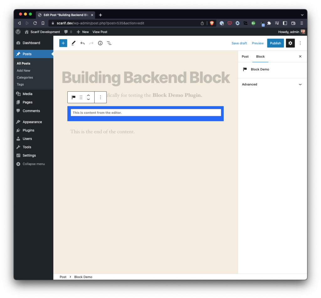
When you run npm run build in the terminal and then add the block to the Block Editor, you should see something like this:
And then you can introduce your own text into the control so that it looks something like this:
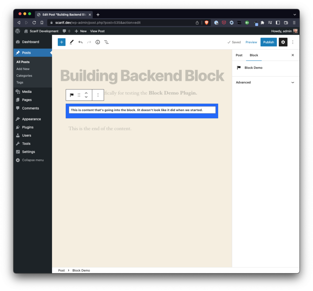
Obviously, though, this doesn’t look like it did when we started and this is where we come to the last part of this particular article.
🎨 Styling the Block
If you’re wondering how this should look, there are two things that are available to easily guide us:
- the existing stylesheet,
- the way the block looks on the frontend (because we aren’t yet rendering what we’ve developed in the
editfunction)
Recall:

And then if you look at the existing index.scss, you’ll see the following:
.tm-block-demo-container,
.tm-block-demo-container,
.wp-block-tm-tm-block-demo {
    color: #fff;
    background: #0d63fd;
    border: 1px solid #0a58ca;
    font-weight: bold;
    padding: 0.5em;
    width: 100%;
}
The gist of what we need to do is to update the input element styles so that it looks like it was part of the div element we initially had in the edit function. To do this, you can use the developer tools in your preferred browser.
Ultimately, you should end up with something like this:
.tm-block-demo-container,
.wp-block-tm-tm-block-demo {
    color: #fff;
    background: #0d63fd;
    border: 1px solid #0a58ca;
    font-weight: bold;
    padding: 0.5em;
    width: 100%;
}

.tm-block-demo-input input,
.tm-block-demo-input input:focus {
    border: none !important;
    background: #0d63fd;
    color: white;
}
Now run npm run build and refresh the browser. You’ll see the following:
- the font looks different,
- the
placeholderhas a different, - focusing on the
inputelement shows a slight border
All of these things can be fixed and we may do this before the series is over; however, the differentiation between the states of the element matter. That is, when there’s just a placeholder and when the user is editing the content matters.
Granted, the colors right now aren’t great in terms of contrast but we’re going to continue moving forward with this block as-is. Ultimately, we’re going to be adding more functionality and we’re going to be allowing the user to change colors of the element.
So I don’t want to get too far ahead of ourselves by introducing content that we’re just going to have to ultimately remove later. In other words, why do work that we’re just going to remove later? 🙂
⏭️ TODO
At this point, we’ve introduced a lot of functionality to the Block Editor and we’ve covered a few additional concepts that begin to give the editor facet of our custom block more utility.
But what good is it really whenever our readers can’t see what’s happening? So in the next post, we’re going to continue building this out specifically so our users can see the changes we’re making in the editorial side of WordPress.
Specifically, we’re going to cover:
- how to save the content,
- render it on the frontend
And that will wrap up this initial part of getting a block started that supports user input and serialization. But there’s even more to go from there.