Where Can I Watch? 1.4.0 is out, and it’s one of the bigger releases since launch. Two ideas drove most of the work: making Today its own top-level tab, and giving Episode Detail a consistent home in every place in the app where you might tap into an episode.
When 1.3.0 shipped, the plan I wrote for 1.4.0 was a detail-page overhaul:
- content rating badges,
- runtime,
- on-your-services callouts,
- and person search.
The more I continued to use the app, the more it was clear the foundation for those enhancements wasn’t quite in place yet:
- Episode Detail only opened from one corner of the app,
- Today was still a pinned section inside Watchlist,
- and the streaming service name, the whole point of the app, was missing from a few places a user would most want it.
1.4.0 puts those foundations in place. The detail-page enhancements will be in 1.5.0, built on top of everything in this release.
What’s New
Today is Its Own Tab
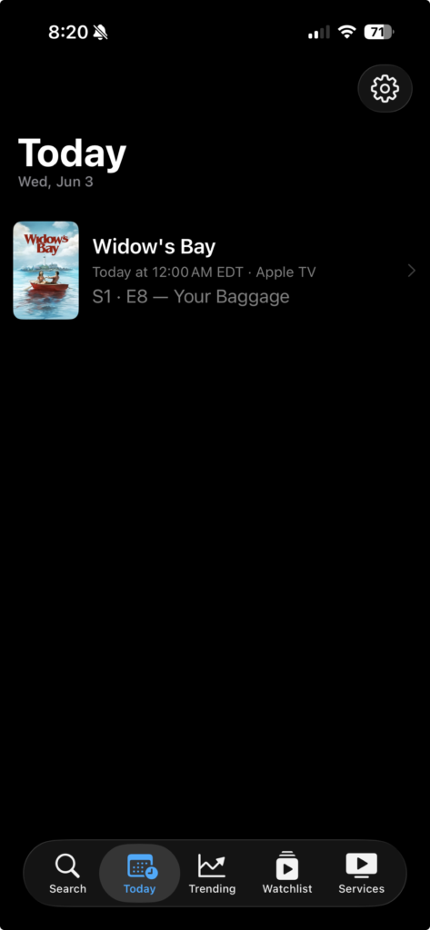
The single biggest change in this release: Today moved out of Watchlist and became a top-level tab next to Search, Watchlist, and Trending.
It’s the screen you open to answer the question, “is there anything new for me tonight?” without scrolling past anything else.
When something is airing, it lists every show with an episode airing today. When nothing is, it tells you that and shows the next upcoming episode as a “Next up” hint so the screen isn’t empty real estate.
Brand-new users with no watchlist get a different empty-state message than active users who just don’t have anything tonight, because those are two very different situations.
Home Screen Quick Actions
Long-press the app icon and you’ll get Quick Actions for Search, Today, Watchlist, and Trending. Same four tabs you’d land on, just one tap removed if you already know where you’re going.
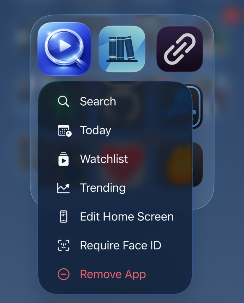
Today in particular feels right as a Quick Action because if I’m reaching for the app at 9pm on a Thursday, that’s the screen I want.
Local Air Times on Today
Each row in Today now shows the actual local release time when the network has a known schedule. So you’ll see “Today at 9:00 PM PDT” for an Apple TV episode instead of just being told something airs today and being left to wonder when today.
The networks with predictable schedules — Apple TV, Netflix, HBO, Disney+, Amazon Prime Video, and Hulu — surface times. The rest still show the date.
Streaming Service Name Where It Matters
The whole point of the app is answering “where do I watch this?”, so it shouldn’t take an extra tap to find out. Every Today row now shows the streaming service name.
So does the Episode Detail sheet’s metadata row. Wherever you’re looking at an episode in the app, the answer to “where” is right there with it.
Small Polish (and Lots of It)
A handful of smaller things all of which add up:
- Today rows now have a subtle scale-and-opacity press animation with a haptic, so taps actually feel like taps.
- The episode label moved from caption to sub-headline so it’s readable at a glance.
- The section header date respects the user’s locale instead of always rendering in English.
- And titles scale down at large Dynamic Type sizes instead of getting truncated.
What’s Changed
Episode Detail, Now Reachable From Anything
This is the part that earns the “everywhere” in the title. Episode Detail has existed for a while, but it only opened from one corner of the app which was the Today section inside Watchlist. Anywhere else, the only thing you could do with an episode was toggle it watched.
Tapping an episode in the Season View used to do exactly that: toggle it watched. It worked, but it didn’t match how iOS apps generally behave. Mail, Reminders, and Messages all treat tap as “open” and reserve swipe for state changes.
Season View now follows that pattern: tapping a tracked show’s episode opens the same Episode Detail sheet you’d get from Today, and the watched toggle moved to a leading swipe action.
Same sheet, same data, same controls all of which are now just reachable from a second entry point. The sheet’s navigation title now reflects the show name when you arrive from the season view, instead of always saying “Today” regardless of where you opened it from.
And this release takes it one step further: opening the detail sheet stops being a tracked-show privilege. Browse a show in Search or Trending, drill into a season, and tap an episode. Then, you get the same detail sheet whether or not the show is on your watchlist.
For a show you’re not tracking, it’s read-only: synopsis, still image, runtime, air date. If it turns out to be something you want to follow, there’s an “Add Show to Watchlist” button right there worded exactly that way on purpose, so it’s clear you’re adding the whole show and not just the one episode. Tap it and the button becomes the watched-toggle in place, so you can check that episode off without losing your spot.
That’s what “everywhere” really means here: if you can see an episode anywhere in the app, you can open it.
What’s Fixed
Today Stop Dropping Shows at Release Time
When a show’s episode aired and TMDB rolled next_episode_to_air forward to the following week, Today would helpfully remove that show from the list at the exact moment you might actually be trying to watch it.
The fix keeps the just-aired episode in Today until the local day ends, which is what “today” actually means.
The Right Episode Opens in the Detail Sheet
A related but separate issue: when a show had both a last_episode_to_air matching today and a future next_episode_to_air, the detail sheet was opening to the future one.
So you’d tap a row that said “Episode 5 aired today,” and the sheet would proudly show you Episode 6, airing next week. It now opens to the episode that’s actually airing today.
Same-Day Episodes for a Single Show
This was the most involved fix. Some networks drop multiple episodes on the same day. For example, Apple TV double drops at premieres, HBO double-headers, the occasional full-season Netflix release.
Today used to surface only one episode per show, so if four episodes of something hit at once you’d see one row and miss the rest.
Now if a show has one to three same-day episodes, each one gets its own row. If it has four or more, the full-season-drop case, it collapses into a single row labeled “Season N · M episodes available” with a stacked affordance that opens a checklist sheet for the lot.
Different shapes for different situations, so the screen doesn’t get overwhelmed by a fourteen-episode Netflix drop but you also don’t lose information about a two-episode HBO opener.
What’s Next
With Episode Detail now reachable everywhere you’d want it, 1.5.0 picks up the enhancements I’d originally lined up for this release: content rating badges, runtime info, an “On Your Services” section on the main detail page, and search by actor or person name. The detail pages got into the right places in 1.4.0. They get more useful next.
If you haven’t tried Where Can I Watch? yet, it’s free on the App Store. No ads, no accounts, no subscriptions. And if you’re on Android or just want the base “where is this streaming” functionality, the web app covers that.