
I’m not a designer and I’ve never claimed to be one, but that’s not an excuse for sacrificing an attempt at creating good user experiences, right?
To be clear, I am not equating user interfaces and user experiences – that’s incorrect. They aren’t the same (though they’re often treated as such). Generally speaking, user interfaces make or break the user experience.
The thing is, developer’s are notorious for creating terrible interfaces.
I’d even go as far as to say as that we have a reputation of creating a horrible user interface then calling the user stupid when they can’t figure out how to use what we created.
Lame.
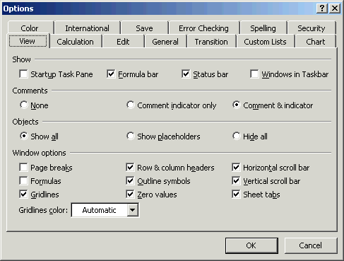
A Stereotypical UI By a Developer
Personally, I try to do what I can to make sure that I don’t create interfaces like what you see above.
I’m not great at it, but I am attempting to get better and I try to make each project an improvement over the last, and I try to make sure that as I go back and revisit, refactor, and improve existing projects, that I incrementally improve parts of it that I can.
That said, there are a few things that I try to keep in mind whenever I’m working on a new project. The majority of the work that I do is with WordPress, so this will be clearly geared towards that, but I’ve tried to generalize these points so that they are applicable to a variety of platforms.
How We Read The Web
Here’s the thing: When it comes to the web, people don’t read – they scan. Jakob Nielson – arguably the father of modern usability – has covered this in a number of articles and studies, at least one of which I recommend reading.
People rarely read Web pages word by word; instead, they scan the page , picking out individual words and sentences.
In research on how people read websites we found that 79 percent of our test users always scanned any new page they came across; only 16 percent read word-by-word.
Still, this point has been made and repeated so much that it’s in danger of being ignored or simply becoming a cliche.
But here’s the thing: Many of us don’t necessarily need people to tell us that this is true because we can observe it in our own behavior.
After all, we do this with articles, we do this when using new devices, and we do this whenever we’re using any given software application.
Simply put, it’s as if our nature is to find the path of least resistance an help us accomplish our intended goal as fast as possible.
On Guardrails and Guidelines

Don’t let your UI do this.
Knowing this, creating user interfaces that are littered with options, labels, and directions can hinder that.
Instead, we should be diligent in taking the finite set of user interface elements that we have and use them to guide the user to their goal.
Specifically, we should take the following elements:
- Labels
- Inputs
- Text Areas
- Buttons
- Checkboxes (though some argue against this!)
- Radio Buttons
- Select Boxes
And use them to construct interfaces that guide the user to their intended goal. In short, they should provide both the guardrails and the guidelines for their interaction with the product.
Of course, this looks different depending on the nature of what you’re building and it’s easy to find examples of products that do just a good job at this as a bad job.
Why Bother Bringing This Up?
I bring this up because I’ve had a number of discussions recently in which other developers and designers in which we’ve discussed how user interfaces should be built.
Ultimately, the point that I’m trying to make is not to tell anyone how to use what elements we’re given – heck, I’m still trying to figure that out and I wrestle with it with every project – but to think differently about how we, as developers, approach the problems that we’re trying to solve.
Here, I’ve given my two cents though I know there are a number of designers and extremely talented (and more experienced!) developers who are out there that have an opinion on this so I’m asking you to chime in as well.
Leave a Reply
You must be logged in to post a comment.