When talking about the difference in themes and plugins, it’s common for those involved in building projects for WordPress to know that functionality is usually left to plugins and that presentation is left to themes.
This doesn’t mean there isn’t some cross-pollination (or perhaps cross-contamination? :) where plugins introduce visual effects and themes offer more functionality than they probably should, but as a rule of thumb, I think it serves us well.
Sometimes, though, I wonder if we don’t think hard enough about what the presentation of content actually means when it comes to designing themes.
WordPress Theme Design
First and foremost, I am not a designer. I’ve never claimed to be, nor do I pretend to be. Instead, I try to stay updated with current design trends, good practices, and so on through reading blogs, articles, and by following designers wherever they may be sharing some of their stuff.
I say that so that I at least qualify where I’m coming from as it relates to talking about theme design.
So a moment ago, I questioned whether or not we do a good job of thinking through the presentation of content as much as we should whenever it comes to designing themes. And here’s what I mean by that:
In the most generic case, presenting content stored in the WordPress database is relatively easy. Use The Loop, iterate through the content, drop it in some HTML elements, and have the browser render it.
Using any of the major front-end frameworks makes that relatively easy to do.
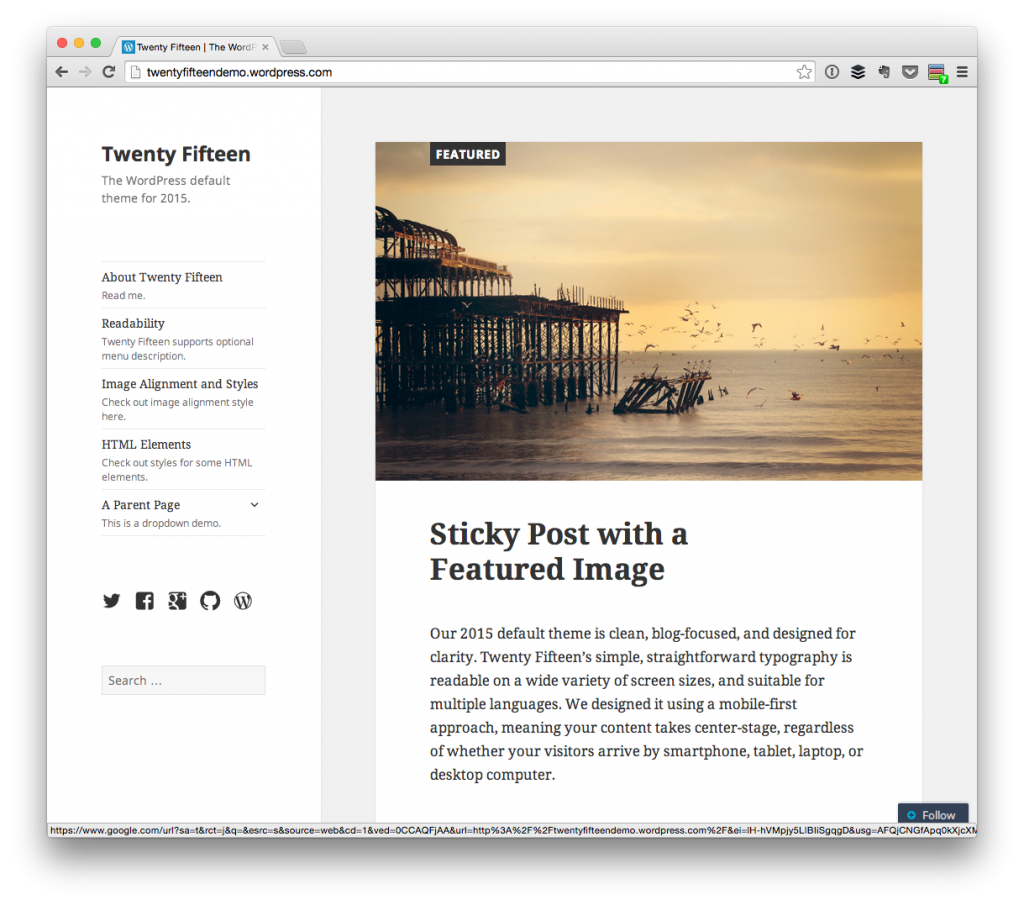
Twentyfifteen
We can take it a step further, though. For example, if you look at Twentyfifteen, the sidebar is stuck to the side of the browser such that it’s persistent throughout the site as you browse through pages and posts.
To me, this says that – at some point in design and/or development – the authors decided that the content in the sidebar carried enough weight such that it should be persistent while users are browsing the site.
Of course, I’m only using this theme as an example because it’s one of the most popular themes at the moment – not because I have any real problem with it (I happen to really dig it) – with the launch of WordPress 4.1. But it does raise a few question that I think we all should be asking ourselves about nearly every element that we opt to display on the front-end of a theme:
- Is this is the most logical place to put this element given its relationship to other elements on the page?
- Does this display in the priority in which it should for the given content?
- Is everything properly emphasized as the reader progresses through the featured image, title, meta data, content, and comments?
Obviously, there are more questions that are worth asking, but the above are some of the few that I’ve come up with when I see newer themes and start thinking through the design-decisions behind them.
And no – I don’t think that users or customers necessarily think in these terms, but we – as people – implicitly feel and notice these things when we’re reading through the content. It’s kind of like potholes in the road:
It doesn’t stop us from getting where we need to go and it doesn’t really negatively affect anything, but it’s annoying to hit one and we notice when we do.
So these are some of the thoughts that we’re asking as we’re getting back into building themes. I’m also curious as to what questions or what process you follow when working on a design, as well (regardless of if you’re more of a designer or more of a developer).

Leave a Reply
You must be logged in to post a comment.