
I’d venture to say that most anyone you ask will say that a product’s landing page design plays one of the most important roles in generating conversions. After all, why else would we have tools and products dedicated solely to studying visitor analytics, data tracking, a/b testing, and so on?
Common sense, right?
Granted, there are certain things that are known to work when building landing pages. That is to say that there are principles that are tried, true, and proven as it relates to creating landing pages for working to sell products to users.
The thing is, all of these principles can be dressed up differently depending on the color scheme, company branding, culture, verbiage, and so on.
With that said – and I’m sure there’s an answer for those of you who are designers, marketers, and/or usability experts who are reading along – how much, if at all, does the consistency of landing page design matter for products that belong to a single brand?
Product Landing Page Design
When you look at what some of the most successful companies do online, you recognize that there is consistency for each of their product landing pages.
That is to say:
- The branding is consistent
- The orientation of elements, calls to action, screenshots, promotional material, and more is in the same place
- The only thing that changes is the images of the product being sold (and perhaps a couple of head shots, if people are involved)
Three quick examples that come to mind:
1. Apple
Check out the pages for the iPad, iPhone, and the MacBook:
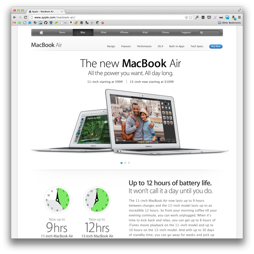
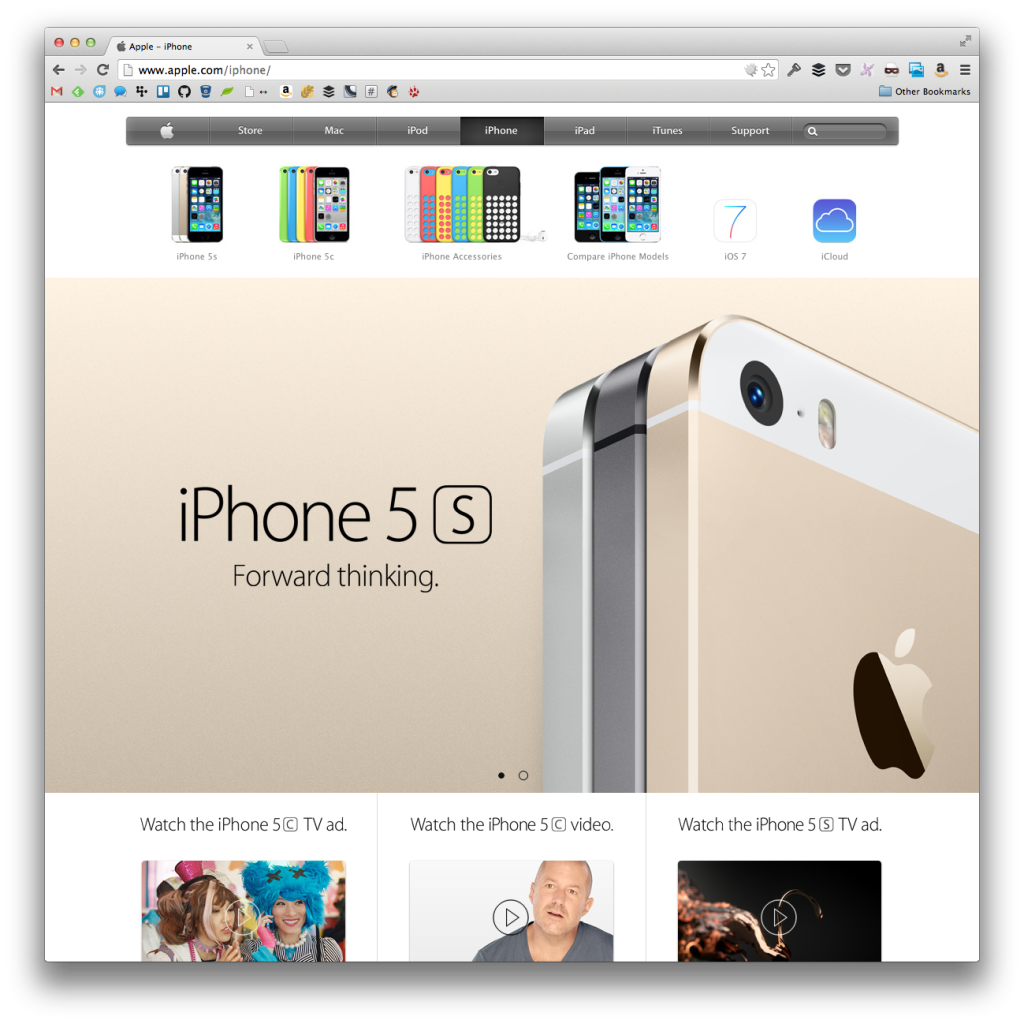
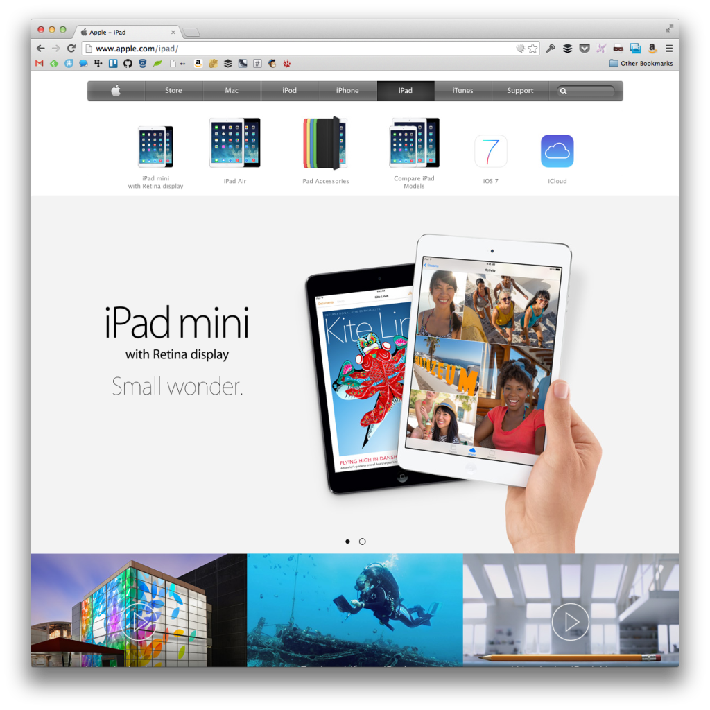
The all contain the following:
- Navigation
- Slider for the product shots
- Feature callouts
- Product description
- Where to buy
All similar structure, right?
2. WooThemes
Note that the following examples include a color scheme for this year’s Black Friday sale. Though the traditional Woo colors are blue and white, the experience for each of the following products is the same:
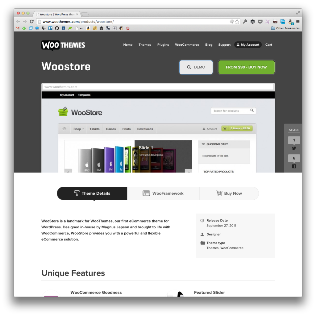
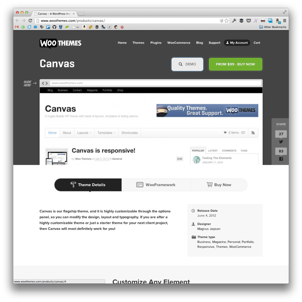
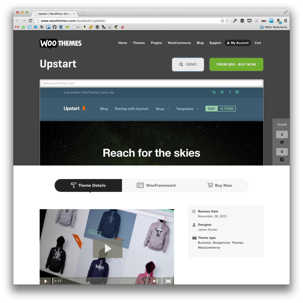
Each product page follows the same landing page design, as well:
- Title of the theme with a demo and a call to action
- A screenshot
- Details of the theme
And this same design is consistent across all of their product pages.
3. 37signals
For as popular as they are and as much research as they place on A\B testing, there’s arguably the most variation of designs across their product landing page designs.
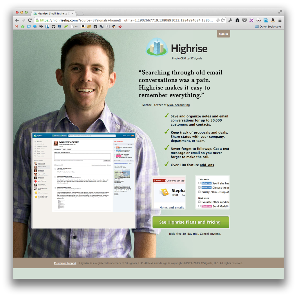

Granted, the first two designs aren’t that different. They both include:
- An actual person
- A quote explaining why they love the product
- A call to action to sign up
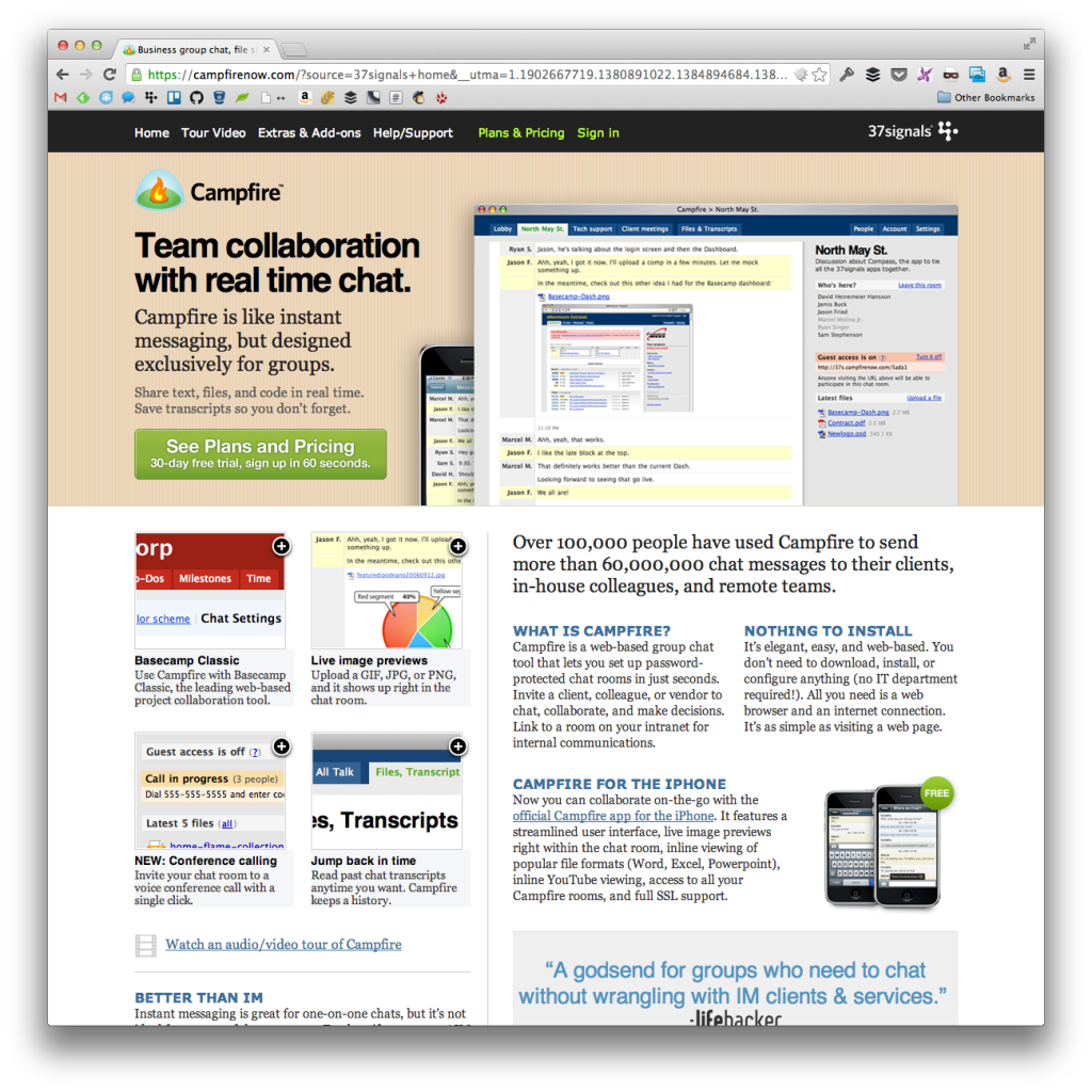
The Campfire product page is obviously the product page that deviates the most. In fact, it’s actual part of the their older designs. Regardless, they still feature some of the same elements.
Namely:
- A short description of the product and why it’s beneficial (similar to the testimonials)
- A big call to action to sign up
Rather than a person, they feature shots of the product.
Consistently Consistent (Or Not?)
All of the examples above have what I consider to be generally consistent product landing page designs.
Based on looking at what successful companies have done, as well as the research in this area appears to suggest is that consistency does matter.
But how much?
For example, if I WooThemes were to change the color scheme of each of the product landing pages, how would that impact conversions?
I venture to say negatively because it would create a disjointed experience for the user. Then again, I’m not a marketer, usability expert, or any of that fun stuff so I’m simply basing that on what amounts to conventional wisdom and my own preferences.
All of that to say: I’m genuinely curious on what you guys – both from your expertise as your subjectivity – think on how much consistency matters on product landing page design across a single brand.
Leave a Reply
You must be logged in to post a comment.