Software Engineering in WordPress and Musings on the Deep Life

The Grid Ruler Chrome Extension

If you work in web development long enough, odds are you’re going to discover your strength lies within writing code or designing a site. It’s possible to be good at both – I’ve seen it in rare cases – but it’s more common for someone to be strong in one area or the other.

As easy as frameworks like Bootstrap, Foundation, 960gs, and so on have made it for us to build layouts against a grid, it has not – thankfully – removed the need for designers (of course, that was never their intent, anyway).

The reason I bring this up is because years ago, a good friend of a mine – a designer, to be clear – would jokingly say I was pixel approximate.

And he wasn’t wrong.

The Grid Ruler Chrome Extension

Specifically, my friend would claim when it came to converting designs into functional sites or interfaces, I might get it close enough to resemble the initial design but it wouldn’t be exactly to spec.

That’s why I stick to writing code :).

More seriously, I focused on getting better at being less pixel approximate and more pixel precise. I still prefer to partner with designers at every chance I get, but I also double-check and triple-check both what I’ve done and what those with whom I work have done in order to make sure the absolute best result is being produced.

And one such tool that makes this possible is the Grid Ruler Chrome Extension.

Grid Ruler

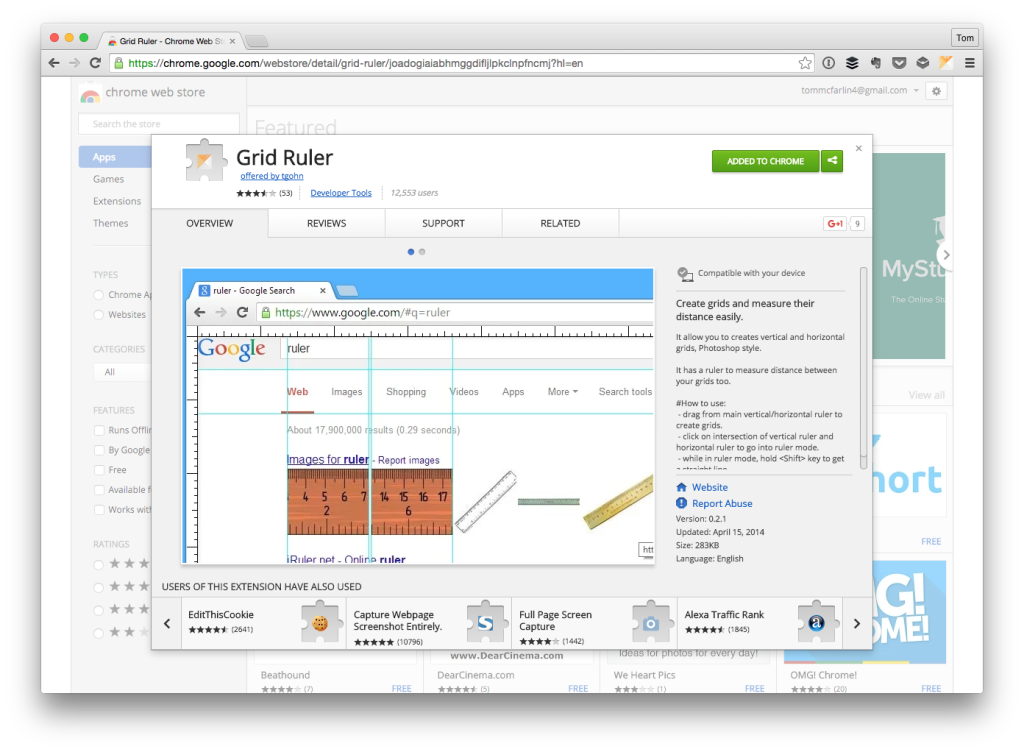
The site for the extension states:

It allow you to creates vertical and horizontal grids, Photoshop style.

And it’s about as accurate, simple, and straightforward as you can get.

When you activate the extension, horizontal and vertical rulers will appears on the page and then you have the ability to create an overlay of lines to measure the layout of the elements on your page.

Compare and contrast this with whatever mockups or designs you’ve been given, and you’ll be able to determine just how approximate – or precise – you’ve gotten in converting the design to a functional site.

The Grid Ruler extension is not something designers will likely need, but if you’re a developer who occasionally works with converting designs into functional interfaces or you’re simply someone who wants to make sure all margins, padding, images, text, and other elements are properly aligned on a project, then the extension is worth the time it takes to install it.

11 Comments

  1. Ahmad Awais

    This is a good extension. Added to Chrome!

    I have had been using RuleJS bookmarklet for years http://ahmda.ws/1WMUMEf .

    • Tom

      Cool – yeah, I tend to be a fan of whatever works best for your workflow :).

  2. Ross

    Before responsive design became essential, an oft-used marketing term from designers was that they created “pixel perfect designs”.

    But that can’t be what you’re meaning here, Tom, right? Pixel perfect doesn’t mean much these days as we rely upon flow and stacking and dynamic resizing, not absolute pixel dimensions.

    That’s not to say that rulers are useful. I use Firefox for my development and…

    http://frayd.us/extensions/measureit/

    …works well for me. Also available for Chrome. A color picker is essential, too. I use ColorZilla.

    • Tom

      But that can’t be what you’re meaning here, Tom, right? Pixel perfect doesn’t mean much these days as we rely upon flow and stacking and dynamic resizing, not absolute pixel dimensions.

      I’m just advocating for use of grids and to try to get solid element organization and placement :).

      I use ColorZilla.

      Yep – love that extension too!

    • Chris Howard

      +1, Ross. It bugs me coz I still see a lot of jobs advertised for “pixel-perfect” designers who have a strong grasp of “responsive design and designing across all platforms”. Wha?

  3. James

    Just throwing out another Chrome extension alternative:

    Tape

  4. Greg

    What’s probably more useful for you matching up with a design is a tool which overlays the original .jpg proof image on your page. Then you nudge things around in CSS until they’re perfectly aligned.

    This goes for responsive designs too, since really that’s usually just breakpoints switching to alternate layouts as the screen shrinks – there’s still often an image from the designer.

    For Firefox, I use PixelPerfect. There’s a Chrome extension by the same name that I haven’t tried (and seems to be from a different crew).

    If it’s new to you, try it – you’ll wonder how you lived without it.

    • Tom

      What’s probably more useful for you matching up with a design is a tool which overlays the original .jpg proof image on your page. Then you nudge things around in CSS until they’re perfectly aligned.

      I like this idea. It’d definitely save time from bouncing back and forth from the editor to the browser(s); but, for now, I think it helps for the designers and development team to be on the same page and to have the front-end framework agreed upon before starting work.

      For Firefox, I use PixelPerfect. There’s a Chrome extension by the same name that I haven’t tried (and seems to be from a different crew).

      Definitely going to check it out :).

Leave a Reply

This site uses Akismet to reduce spam. Learn how your comment data is processed.

© 2023 Tom McFarlin

Theme by Anders NorenUp ↑