When it comes to building custom WordPress applications, plugins, or themes, one of the things that I’m a big proponent of doing is maintaining the native WordPress admin look and feel.
That is to say that I am not a fan of introducing option pages or other elements that deviate from the styles that WordPress core provides.
Case in point: Theme settings pages should match the same theme as the rest of the settings pages in WordPress. There shouldn’t be any major deviation in color scheme, font, or the way certain elements function. By that, I mean tabs should work without any fancy animation, and so on.
But there are times when modifying core user interface components that enhance the experience and that do deviate slightly from the core native WordPress core styling.
In those cases, is deviating from WordPress core acceptable?
The WordPress Admin Look and Feel
Everyone is familiar with the WordPress dashboard. Even if you’ve not sit down to explain to someone exactly how it looks or functions, you’re likely familiar with all of the common elements:
- Primary action buttons are blue, secondary actions are gray
- Radio buttons, check boxes, input boxes, labels, and anchors are relatively vanilla
- Meta boxes (or “those little boxes on the side“) can be collapsed and even moved around
- The primary menu functions like an accordion (or “it hides certain items when you’re in a different menu.”)
And all of that would be relatively accurate, right?
Sure, some themes and plugins introduce their own menu icon and I know that there is even debate among the community as to if this is acceptable or not.

This is not the look and feel you were looking for.
After all, on one hand, your icon is part of your branding so it associates your application with your brand. On the other hand, colored or vibrant icons differ from the core WordPress experience which some say can detract from the overall experience.
Regardless, this post is not about whether or not we should be including, y’know, colored icons or not. Instead, it’s about the following question:
If I can introduce a new element into my plugin that will enhance the user experience all the while maintaining the native WordPress experience, is it acceptable?
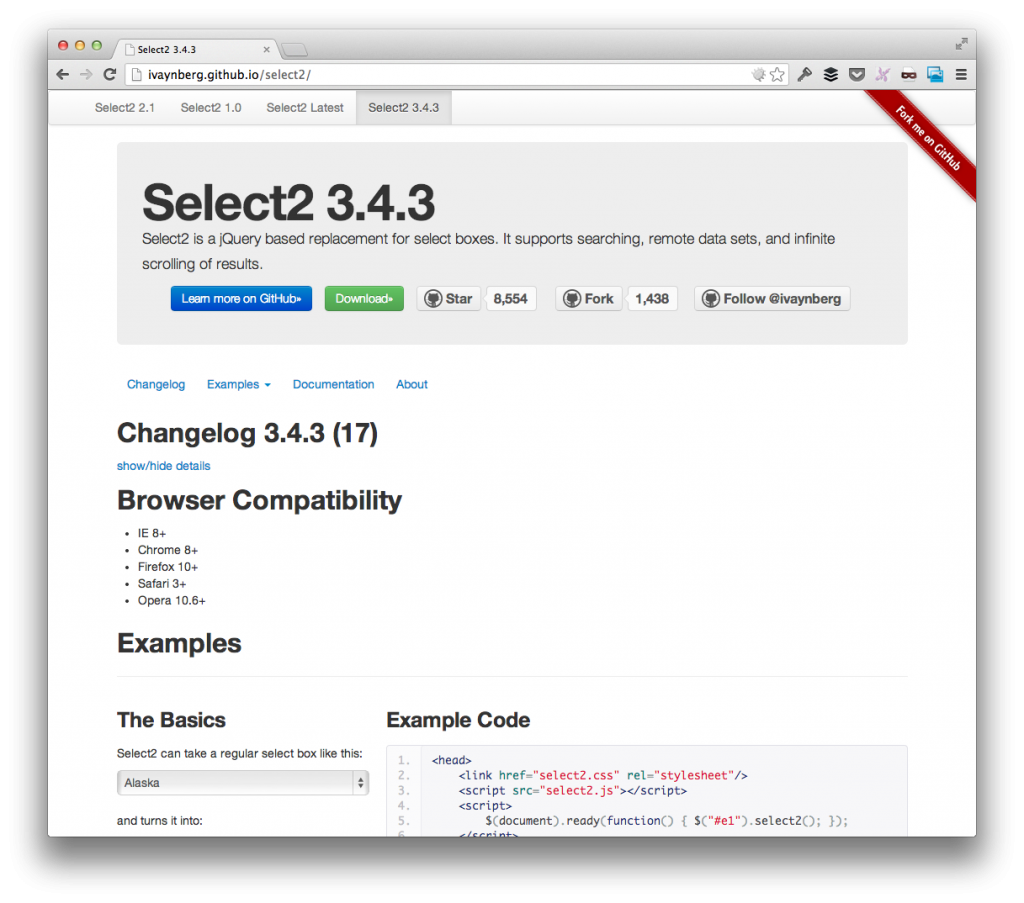
For Example, Select2
This is a simple example as it deals with a single, common element with which we’re all aware, and it deals with a common problem which we’ve all experienced.
So here is my thought process for how `select` elements work not only within the context of WordPress, but within both web sites and web applications, as well:
- `select` elements are used to provide a list of options
- Lists of options can grow exceptionally long forcing the user to scroll through to find what they need
- Scrolling through to find what you need is a tedious task
- Filtering saves time when looking for a needle in a haystack of options
- Introducing the ability for users to filter `select` options enhances the user experience
Select2 is a jQuery plugin that replaces the native `select` element with a `select` element that not only displays all of the available options, but also allows the user to type to filter out the available options.
Straight from the website:
Select2 is a jQuery based replacement for select boxes. It supports searching, remote data sets, and infinite scrolling of results.
There’s no need to provide a demo as the website provides plenty right from the homepage.
But this serves as a prime example of what I’m talking about: Introducing this particular element into your code will enhance the user’s experience, but it deviates from the WordPress core functionality.
So this raises the question: is incorporating something like this in your work acceptable within the wider scope of WordPress?
Yes, But Not Without Caveats
There’s a fine line to walk between introducing elements just because we can or just because they “look cool,” and introducing them because they allow us to give the user a more pleasant experience than they had prior to the enhancement.
But this comes at a cost: We’ve now introduced an element that works different than the rest of the elements of the same type throughout the admin.
Specifically, our plugin may introduce something like Select2 which looks great, functions well, and makes the user’s job easier, but it deviates from all of the other native `select` elements used throughout the dashboard.
So this is the caveat: do we enhance the user’s experience at the risk of creating a gap between what they’ll see elsewhere, or do we leave them to a weaker experience for the sake of the greater application?
In short, I’m fine with doing what I can to enhance a person’s experience with my work even though I know it comes at the cost of creating a gap in the experience.
Where Do We Draw The Line?
The truth is, I’ve strong opinions, weakly held. I could be persuaded one way or the other given strong enough arguments, but I’ve stated my reasoning.
I’m curious as to what others think:
- Introduce a minor change of functionality into an element, or a set of elements, with which you have control at the sake of causing a gap between the rest of the dashboard’s elements, or
- Stick as closely to native as possible such that there’s almost no distinction between what’s WordPress core and what’s your own work?
Genuinely curious as to how this is taken by the rest of you designers and developers out there.


Leave a Reply
You must be logged in to post a comment.